Do you have a favorite color? Well, I think we all have one or we may say, no, I don’t! but I bet you would agree with your mind that perhaps some cool colors appeal to you more or maybe it's just the very bright ones, just like a range of ladies love the color pink or white.
Colors, as we have understood always set a tone, an impression, and could influence our decision or judgment. This can easily be illustrated by how the color white is used to signify peace and when an unpleasant event occurs, very dark colors might be considered to represent and convey the information probably without saying much verbally.
My point? Color Considerations
Colors sure have a way they speak to us, hence there is a need to ensure that while trying to convey a message, the right colors should be considered.
A carefully thought color scheme could make your application stand apart from your competitor’s app. colors are quite an essential part of your application and how they could influence your app on application stores. It shouldn't be an argument that the visual appearance of your application is the first thing that attracts potential users. So, I guess it's ok to say that after functionality if there is something that matters most to your mobile app, it should be its design and Mobile App Color Themes.
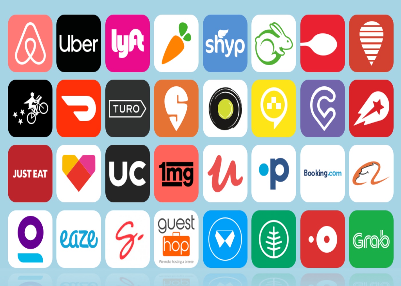
If we are to do a flashback on the colors seen on the app store, you would agree that a host of them if not all have some mesmerizing colors, just because they understand that users love colors, therefore colors attract, just as it helps with brand identification.
In this article brought to you by The Watchtower - Web Design Agency Dubai, I would be sharing with you some color considerations while developing your Mobile application; first of all, research had shown that color preference had been identified with some meanings, like:
- Green is usually identified for growth or with the environment and in some cases wealth and money.
- Yellow as a color is related to optimism and joy.
- Orange, enthusiasm, and excitement.
- Red color portrays excitement, force, and stimulation
- Blue had always been for trust and quality.
Would you believe that even Psychologists have examined how people are influenced by colors and found a solid relationship between colors and emotions, this further buttresses the point that picking the right color is essential in deciding a brand pick? Examples are: Food brands as Mc Donalds, KFC has a color Red in their brand; where red represents Hunger or the fact that Gold, White, or Silver are often used for luxury designer brands? The list is endless.
Another thing to consider would be the category your app would fall into.
According to research, our
reality is shaped by our past experiences and perceptions. If we have had a
calm and relaxing experience by simply watching the sea (which is blue), we
will associate the feeling of relaxation with the color blue – every time. Just
as with food brands being identified with Red or social media platforms like
WordPress, Facebook, Twitter to Blue.
So, maybe it's pure coincidence,
or maybe a calculated marketing scheme, well whatever it could be called, it
sure works and that is the goal.
Consider these things:
- What colors come to mind when people think about the problem your app solves?
- What colors do the majority of the apps in your app's category use?
- What color would cause people to have a negative opinion of your solution?
Also, choose a color for your application icon. The application icon colors should concisely and demonstrate the utility of the application. The mobile app color pick you choose for your application icon will help identify or characterize the entire app.
If you intend to work on a gaming app, please remember that all games have an image/character which portrays an emotion. Research has shown that over 38% of the top-rated games have an image as their icons, usually with bright colors.
To summarize, the visual appearance of your application is the first thing that attracts users. When your users place a high value on the appearance of your application, the UI and UX come into play.
For more insightful tips on Mobile app development, Website development, Digital Marketing, and SEO, you can always trust The Watchtower, the best and award-winning Website Development Company, Dubai.


Comments (0)
Write a Comment