
Two friends wandered the streets of London on a drizzly afternoon, looking for a bite. They weren’t craving a particular cuisine. What pulled them in was a glowing neon sign in the shape of a noodle bowl they’d seen just an hour earlier while scrolling. The restaurant? A little ramen bar with hypnotic pink lighting, steamy windows, and artfully stacked toppings that looked more like a sculpture than soup. They went not for the broth, but the photo.
Welcome to the new way people choose where to eat. Once upon a time, it was recommendations or cravings. Now? It’s often a glance at a tagged post, a story highlight, or a trending location pin. A surprising 70% of diners admit to checking Instagram before choosing a restaurant. It’s not just about the food anymore. It’s about the scene, the share, and the story.
Visual branding has moved from a supporting role to the main stage in the restaurant world. It doesn't whisper. It commands attention.
"We Eat With Our Eyes First"—A Sensory Science Breakdown
Let’s start with the human brain. That stubborn organ has always been a bit vain when it comes to food. Long before we ever knew what dopamine was, we were reacting to the color of fruit, the shimmer of fat, or the char on a piece of meat. Visual cues were how we decided if something was safe, fresh, or desirable.
Now, neuroscientists back up what chefs have always intuitively known: we don’t just look at food, we feel it with our eyes. Colors activate specific regions in the brain. Red and yellow, for example, spark appetite. The gleam of a perfect glaze? It hits the same pleasure centers as a catchy melody.
And here comes social media, that infinite buffet of glossy visuals. Each scroll is a mini slot machine of pleasure. You see a pastel-drenched smoothie bowl and you’re not just hungry—you’re intrigued, delighted, maybe even envious. That’s the dopamine loop at work. The more we feed it, the more we crave.
So it’s no wonder diners trust what they see over what they read. A menu description might say “farm-fresh heirloom tomato,” but a close-up of that same tomato, sliced and sprinkled with flaky salt, drenched in golden oil? That image seals the deal.
Scroll-Stopping Plates in a Swipe-Right Culture
A generation ago, the restaurant critic had the final word. Today? It’s the diner with a good eye, a phone camera, and a solid filter game. TikTok, Instagram, Pinterest—these platforms are where food trends are born, debated, and sometimes devoured.
Enter the era of the social media food tour. People now plan vacations around viral eats. They line up for hours to bite into a croissant cube because it showed up on their For You Page. Rainbow bagels, galaxy lattes, gold-covered steaks—these aren’t necessarily about flavor. They’re designed to arrest attention in a thumb-scrolling world.
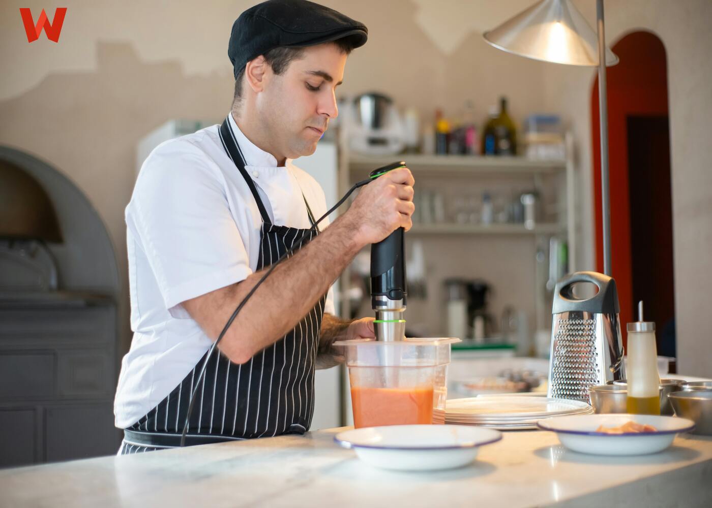
And the chef? Still central, but now part content creator. The kitchen becomes a photo studio. The plating? A layout that considers camera angles. The sauces might be splashed for flair, but they’re also curated for color.
That’s not a knock. It’s evolution. The plate is no longer just a vehicle for nourishment. It’s a visual story.
The Restaurant as a Visual Brand Experience
Step inside certain spots and it feels like you’re stepping into a photo filter. Think of Elan Café in London with its walls of pink blossoms, or Sketch with its candy-colored plush seating and futuristic bathrooms that could double as alien pods. These aren’t just eateries. They’re immersive brand environments.
The restaurant is now a canvas, with each design element reinforcing the story. Neon signs aren’t just lighting—they’re hashtags made physical. Mural walls double as backdrops for influencer shots. Even restaurant furniture gets in on the act, chosen for texture, color, and how well it plays in a frame.
Menus now match the mood: gothic print for dark-themed bars, pastel script for brunch cafes. Everything is curated to flow from in-person to online, feeding the digital persona of the brand.
It’s deliberate, and it’s smart. Because when the space looks good, the diners become your marketers.
Behind the Scenes of the Perfect Post
Let’s demystify things. That perfect overhead shot of pancakes dripping syrup didn’t just happen. There was food styling, maybe even a little inedible trickery (motor oil for pancake syrup, anyone?).
Photogenic food often requires a tweak or two. Ice cream that doesn’t melt? That might be mashed potatoes in disguise. That glossy burger bun? It got a little massage with oil for the photo.
Plating is an art, and color psychology is the artist’s palette. Cool tones tend to calm. Warm tones energize. High contrast makes dishes pop. And even messy food can look beautiful with the right frame—deconstructed plates on clean backgrounds, for example, let viewers fill in the taste gaps themselves.
These details aren’t just for show. They’re the quiet tools that make a dish scroll-stopping.
Metrics That Matter—How Aesthetics Drive Bookings
Let’s talk numbers. A well-lit image can literally put butts in seats. Data from OpenTable and Yelp show a direct link between high-quality visuals and increased reservations.
It makes sense. A stranger’s snap of your signature pasta dish might inspire three more bookings. That’s UGC in action—user-generated content as free, authentic promotion. In fact, 30% of diners say they’ve gone to a spot because they saw it on someone else’s feed.
Visual branding, then, isn’t fluff. It’s currency. It’s what turns a restaurant into a destination. The return on aesthetic investment is real: more impressions, more saves, more stories, and more people walking through the door.
When Art Meets Appetite—Menus as Visual Storytelling
Menus used to be laminated lists. Now? They’re interactive portals. Some restaurants offer digital tablets with images. Others use AR to show the dish in 3D before you order. Some go full theatre, printing menus on textured paper, wrapping them in themes: vintage romance, intergalactic diner, art gallery chic.
It’s more than aesthetics. It sets a tone. A visually designed menu primes you for a particular kind of meal. Minimalist layout? Expect precision. Doodles and pastels? Think whimsy and comfort.
The menu becomes an appetizer in its own right, teasing what’s to come not just in flavor, but in mood.
The Double-Edged Fork of FOMO
There’s a downside to all this beauty. The pressure to be post-worthy can lead to fatigue. Chefs chasing trends may burn out trying to top their last viral dish. Plates become costumes. Some diners care more about the photo than the flavor.
And yet, backlash is brewing. The "ugly delicious" movement, spearheaded by chefs like David Chang, pushes back. It says: forget the filters. Let food be bold, messy, honest.
This tension adds richness to the story. Yes, aesthetics draw us in. But authenticity keeps us there. The smartest restaurants know how to thread that needle.
Around the World in 8 Filters
Visual branding is a global language, but with local dialects. In Japan, cafes lean into kawaii culture with bunny-shaped pastries and pastel overload. In Dubai, luxe is the norm: gold flakes, sculptural desserts, immersive spaces. Scandinavia brings its own voice—earthy ceramics, pale wood, food that whispers.
Social trends ripple across borders fast. A boba tea trend from Taipei can show up in a Toronto cafe by the end of the week. TikTok collapses time zones. Aesthetic dishes become international with just a few swipes.
What this means for restaurants? Think local, but present global. Your visual identity might be rooted in your culture, but your audience is anywhere and everywhere.
A Visual Branding Toolkit for Restaurateurs
Let’s land on some useful notes. If you’re building or refreshing your food brand:
Light is king. Natural light trumps filters.
Invest in textures. Matte ceramics, wood, stone. Your table is your set.
Play with height. Elevate some elements for drama.
Color pops. Garnish with purpose. Herbs, flowers, chili oil.
Use story elements. Tie your plating to your restaurant’s narrative.
Encourage UGC. Create photo-ready spots: a logo wall, a quirky corner.
Be cohesive. Match your menu design to your dishes to your space.
Highlight personality. Not every dish needs to be fancy. It needs to be you.
Use photo-friendly plating. Asymmetry, white space, deliberate mess.
Don’t fake it. Authenticity reads. If you don’t love the look, your diners won’t either.
These aren’t rules. They’re ingredients. Season to taste.
Is This the Golden Age of Food… or Just a Filtered One?
There’s something fascinating happening. Restaurants aren’t just cooking meals—they’re curating moments. Visual branding has become a kind of cuisine in itself, feeding our need for novelty, beauty, and connection.
But aesthetics alone don’t satisfy hunger. The places that thrive in this new landscape aren’t just photogenic. They’re thoughtful. They balance the visual with the visceral.
So go ahead—stack your pancakes like Jenga. Paint your lattes with foam art. But let there be heart behind it. The photo might get them in the door. But the memory is what brings them back.
After all, food isn’t just content. It’s communion.








Comments (5)
Ludmilla
Sep 01, 2025
Please keep us up to date like this. Thank you for sharing. สล็อต 99th.
Janell
May 26, 2025
Dla wielu graczy wybór między klasycznymi grami kasynowymi a loterią liczbową bywa trudny. A co jeśli da się połączyć te dwa światy? Coraz więcej platform oferuje rozrywkę, która łączy emocje znane z kasyna z prostotą i dostępnością gier liczbowych. Jeśli interesuje Cię taka forma gry – koniecznie odwiedź http://kasynolotto.pl. To nowoczesne podejście do grania, gdzie znajdziesz zarówno losowania typu lotto, jak i automaty, bonusy oraz promocje dla nowych użytkowników. Wszystko w jednym miejscu, bezpiecznie i zgodnie z polskim prawem. Zanim zdecydujesz się na jeden typ rozrywki – sprawdź miejsce, gdzie możesz mieć wszystko naraz. Zagraj mądrze, graj legalnie!
Gerta
May 20, 2025
Hello there! My buddy at work kept talking about a crash game he’d discovered, so I finally checked out https://aviators.mw on my phone during lunch. In Malawi, mobile performance can be hit or miss, but this loaded instantly and let me dive straight into the plane’s ascent. I found myself timing my cash‑outs to beat the graph’s wild swings—sometimes I celebrated small wins with my girlfriend in the kitchen. It felt like we were cheering on a real takeoff, and now I save it as my go‑to when I need a quick, fun break from emails.
Julia Thompson
Mar 28, 2025
Great article! It’s fascinating how visual appeal now plays such a huge role in dining choices. The same applies to coworking spaces like Coworking Winterthur —aesthetics attract, but the real value is in the experience.
SMM Panel
Mar 28, 2025
Such an insightful post. I really appreciate the depth of knowledge you’ve shared." smm panel cheapest
Write a Comment